Here are a few paintings from a class that I took called "Color and Design". In this class, we were not allowed to blend any colors (on the painting itself) so we had to flat paint all of the areas on the painting.
 
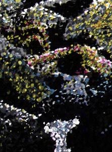
These pictures are from a pointelism projec t that I did. The picture on the left is an origional picture that I worked from while the one on the right is the pointelism. Below is a detail of the pointelism.
We had to do a portraiture painting. Origionally I was going to do a painting of a picture of my sister that I once took. It is a pretty neat picture. I got her to put on a funny hat while I spun a bicycle tire on the top of her head. She is crossing her eyes and sticking out her tongue. Unfortunately, I could not get the picture to translate to paint very well so I decided to do this guy instead.

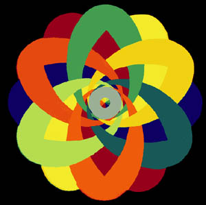
Here is another one. We had to use adjacent and split complementary colors of a primary for this one.
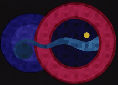
I like this one, but my teacher was not impressed. This one took way too much time since it had so many colors and they all had to be precicely painted. We had to do value matching for this one, so I had a second painting just below this one that was a black and white version of this.
|